 |
| "Painting Interior Design" |
Thursday, March 19, 2015
Vanishing Point
In the next lesson that we learned is about using "Vanishing Point" in Photoshop. You can make a design of a room or even though in making a design to your future house whether ceiling, floor, and wall. This vanishing point helps you to enhance your skill in designing like house (interior or exterior) and etc. In the image below, this is my one of my design that I make:

Sketch using Photoshop
Photoshop is one of the most powerful in editing images and anything you want to create an artwork using this. My Professor teach us some basic techniques to make "Photo to sketch" and etc. Here are some artworks that I make during the class:
 |
| Photo to sketch (Ed Sheeran) |


Text Portrait
Text Portrait - a portrait using many words/ text. In Photoshop, you can make your own portrait using text with different styles. My Professor teach us a technique on how to make this. In the picture below, this is the examples and my text portrait (artwork) that I make:
%2Bprint%2Bfinal.jpg) |
| Taylor Swift |
.jpg) |
| Ed Sheeran |
%2BEd.jpg) |
| My Final Artwork in Color Theory :) |
Tuesday, February 24, 2015
3D
One of the most exciting part of the discussion is how to make a "3D Anaglyph" in Photoshop. My professor teach us the instructions in basic 3D using the channel "red". The most laborious part in making 3D anaglyph is creating "Depth of Map"(an image or image channel that contains information relating to the distance of the surfaces of scene objects from a viewpoint.) with various shades like white, gray, and black. When we done to make this, it is easy to create an amazing 3D.

In the picture below, this the example of depth of map that I create:
It is use this depth as displacement map. Select the image that you made depth, then displace the red channel and the green channel. (filter+ distort+ displace+ Depth of map (psd) ) then edit the horizontal scale to -2 (for red channel only) and 2 (for green channel only) and the vertical scale to 0. Displacement Map: Stretch to fit. Undefined Areas: Wrap Around.
Use your 3D glasses (cyan and red) to see the reality of the image.
My 3D Anaglyph that I create:
 |
| "The Rape of the Sabine Women" (Baroque Sculpture) |
 |
| "Tekken Tag Tournament 2" (characters) |
Typography
One of my Professor discuss is about the "Anatomy of Typography". Typography is a technique of arranging type to make beautiful. Each part of a letter has a parts. As you can see in the picture below, this is the parts of typography:

The strokes of a letter may be curved (open or close) and straight (horizontal, diagonal or vertical)
There are many fonts with different styles . or design. In typography, the font family or they called typeface is a set of one or more fonts each composed of glyphs (elemental symbol) that share common design features.
Thursday, February 5, 2015
CALLING CARD
I learned how to make a calling card. In this picture below, this is the example of calling card that I make:
Calling Card may refer to the following:
- Visiting Card
-Tart Card
- Business Card
-Telephone Card
 |
| Calling Card for Hotel & Restaurant (Business Card) |
 |
| Calling Card for Fast Food Chain (Business Card) |
 |
| Calling Card for Photographer |
Calling Card may refer to the following:
- Visiting Card
-Tart Card
- Business Card
-Telephone Card
Thursday, January 22, 2015
File Formats
What is File Formats?
There are as many different file formats as there are different programs to process the files:

A file format is a standard way that information is encoded for storage in a computer file. It specifies how bits are used to encode information in a digital storage medium. File formats may be either proprietary or free and may be either unpublished or open.
-Word documents (.doc)Web text pages (.htm or .html)
-Web page images (.gif and .jpg)
-Adobe Postcript files (.ps)
-Adobe Acrobat files (.pdf)
-Executable programs (.exe)
-Multimedia files (.mp3 and others)
-Adobe Postcript files (.ps)
-Adobe Acrobat files (.pdf)
-Executable programs (.exe)
-Multimedia files (.mp3 and others)
There are many different file formats in images, videos, music, and so on.

 |
| For images |
 |
| For audio/ music |
 |
| For videos |
I learned the different file formats and what is the most useful compared to others.

.jpg)
Typography & Logo
We discuss about the "TYPOGRAPHY" and the "LOGO".
In typography, when designing layouts and setting type, it is important to understand the basics of working with text, line spacing, and letter spacing. I know how to use tracking- (which refers to uniform spacing between all of the letters in a group of text. By increasing tracking in a word, line of text, or paragraph, a designer can create a more open and airy element) and leading- (the distance between the baselines in the paragraph) and different "CHARACTERS". I know how to use warped text.
In typography, when designing layouts and setting type, it is important to understand the basics of working with text, line spacing, and letter spacing. I know how to use tracking- (which refers to uniform spacing between all of the letters in a group of text. By increasing tracking in a word, line of text, or paragraph, a designer can create a more open and airy element) and leading- (the distance between the baselines in the paragraph) and different "CHARACTERS". I know how to use warped text.
There are different types of logo:
- Text Based
- Emblem/ Ionic
- Illustrative/ Illustration
The characteristics of a good logo design:
- 2 colors or less
- simple
The continuation in using Photoshop and Brush tool
Im so happy because I know what are the basics and techniques using Photoshop and I know the variety of tools and how to use it. Many tools typically fall under the categories of drawing; painting; measuring and navigation; selection; typing; and retouching.
One of the most tool that most exciting, the "Brush tool". In using this tool, you can make your own brush styles like for example, "Stickers/ Colorful stickers" and there are different styles like watercolor, real smoke, real blood splatters and etc. They discuss about the "Brush tip shape" (Color Dynamics, Scattering, Texture, Dual Brush, Color Dynamics, Transfer, Noise, Wet Edges, Airbrush, Smoothing and Protect Texture).
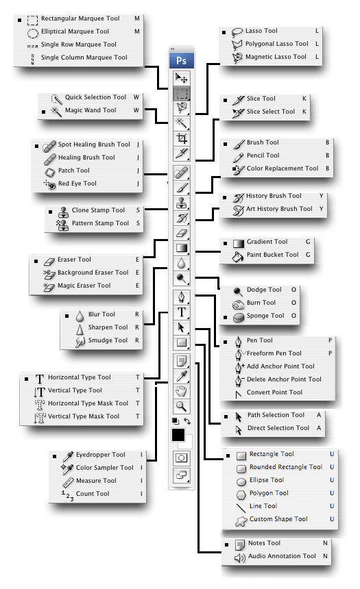 |
| DIFFERENT TOOLS IN PHOTOSHOP |
My Artworks:
 |
| "Dried Blood Splatter" Brush |
.jpg) |
| "Watercolor and Real Smoke" Brush |
Puppet Warp and Content- Aware
I learned how to use "PUPPET WARP" in Photoshop. It is useful when you want to bend or to move your object/ image that you want to warp like a puppet. In using this tool, you can use to make "stop motion".
In step by step to use this tool, open an image you want to warp whether it is a person, thing, animals or etc. that has been isolated from their background. Click edit> Puppet Warp and click to place pins in everywhere example in this image, the pins place in joints. You might place a pin at the wrist, shoulders, elbows, hips, neck,ankles, and knees. Click on the pins you’ve placed and drag to move that point in space. Photoshop automatically warps the pixels controlled by this point to create a new composition for the body parts you've selected.
 |
| This is the example of "Puppet Warp |
I learned how to use "CONTENT-AWARE". It is painstaking to use this. It is use to remove the unwanted elements/ objects.
 |
| Before and after when you use content- aware |
Thursday, December 18, 2014
Rule of thirds
What is "Rule of Thirds"?
It is a guideline which applies to the process of composing visual images. It is used in photography, paintings and etc. It is applied by aligning a subject with the guide lines and their intersection points, placing the horizon on the top or bottom line, or allowing linear features in the image to flow from section to section. The main reason for observing the rule of thirds is to discourage placement of the subject at the center, or prevent a horizon from appearing to divide the picture in half.
It is a guideline which applies to the process of composing visual images. It is used in photography, paintings and etc. It is applied by aligning a subject with the guide lines and their intersection points, placing the horizon on the top or bottom line, or allowing linear features in the image to flow from section to section. The main reason for observing the rule of thirds is to discourage placement of the subject at the center, or prevent a horizon from appearing to divide the picture in half.
This is one of the most useful composition techniques in photography. It's an important concept to learn as it can be used in all types of photography to produce images which are more engaging and better balanced.
 \
\
In the picture below, this is the Rule of Thirds:
\
When framing a photo, imagine the scene divided up as above. Think about what elements of the photo are most important, and try to position them at or near the lines and intersections of the grid.They don't have to be perfectly lined up as long as they're close. You may need to move around to get the best composition. This forces you to think more carefully about the shot, and is a good habit to get into whether you're using the rule of thirds or not. To help you out, some cameras have a setting which overlays a rule of thirds grid onto your photo. This removes all guesswork and helps you get your positioning even more accurate.
This is the examples:
 |
| ORIGINAL PICTURE |
 |
| WITH "RULE OF THIRDS" |
http://www.photographymad.com/pages/view/rule-of-thirds
http://en.wikipedia.org/wiki/Rule_of_thirds
http://en.wikipedia.org/wiki/Rule_of_thirds
Thursday, December 4, 2014
Learned (Color Theory)
Design is a creation of plan for the construction of an object and a designer is a person who designs and they are a problem- solver because they do their best to plan and to finish it perfectly. As a student, I learned a lot about planning and manage to make a brochure, magazine and etc. for my/our clients.
These are the following that I learned how to plan and be a designer (problem- solver):
· Name of Client- to find out who is the name of your customer.
· Audience- To know if they are a children, teenagers, adult, men or women and etc. in making this project or task.
· Objectives- Something that one's efforts or actions are intended to attain or accomplish; purpose; target.
· Goals- The purpose toward which an endeavor/ activity is directed.
· Benchmarks- a process of one’s business processes.
· Projects- involving design or research. They ask a question to your clients based in making project/s or task. For example: choose a color, who is your audience?
· Budget and Timeline- This is the important to ask for your client.
Next, I know what “Color Wheel” is and the color relationship between primary colors (BRY), secondary colors (GOV), analogous, complementary colors, monochromatic and so on. I know what are the meanings or the characteristics of each color. Lastly, I learned something and basics about using photoshop.


Subscribe to:
Posts (Atom)